The question I started with to explore the dataset was “Who is 311 really for?”. In a perfect world, response time would be quick and equitable around the city, but I wanted to see how complaints are distributed across New York City, how quickly they are closed, and whether patterns suggest differences by place or problem type.
The dataset comes from the NYC Open Data Portal’s 311 Service Requests and covers January–December 2024. Each request includes complaint type, borough, latitude/longitude, the responsible agency, status (open/closed), resolution description, and created/closed dates. From these fields, I focused on two core measures: where complaints are filed and how long they take to close. Resolution time is calculated as the difference between the created and closed dates. It’s important to name the limits. Some requests never show a closed date, which makes resolution time incomplete. Resolution descriptions can be vague or inconsistent across agencies, so “closed” doesn’t always mean “resolved to the resident’s satisfaction.” And there’s a deeper bias: 311 reflects who reports and how THEY report, not necessarily where conditions are objectively worst. Communities with less access to technology, language supports, or trust in city systems may be underrepresented. Part of my original question was to see whether my borough, the Bronx, was the dirtiest, and I can’t give a conclusive answer to that, but according to this dataset, it isn’t.
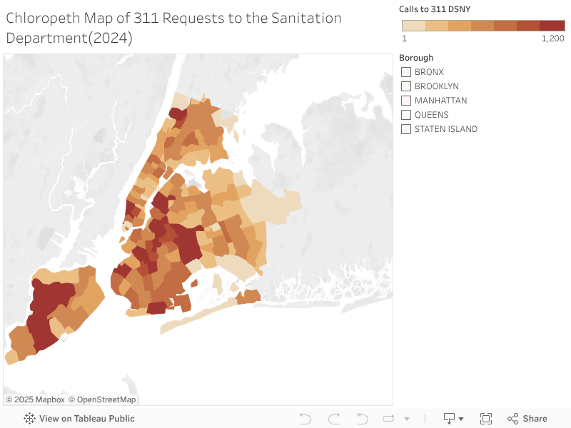
The first visualization displays a map of zip codes, shaded to indicate which ones have the most requests to the Sanitation department. Darker shades indicate the zip code has a higher amount of calls, and according to this map, Brooklyn and Queens have the highest volume of calls.


These visualizations look into resolution times in certain neighborhoods. The first looks at a street level, for example, the visualization is looking at the Grad Center, and the second looks at resolution times at a broader level, zooming out to Zip Codes. The Neighborhood map looks at resolution times in days, and the colors are set to Red, Green, and Yellow, where Green has short resolution times and Red has longer wait times, with Yellow in between them. This map, combined with the first, shows an interesting relationship between the number of calls and resolution times because Queens had the highest volume of cases, but as a borough, the resolution times are short in relation to the rest of the city. Also, Staten Island, in relation to the rest of the city, has relatively high resolution times similar to the Bronx.
The bar charts make these borough‑level differences even clearer.


The first chart shows the total number of sanitation‑related complaints by borough. Brooklyn and Queens stand out with the highest counts, while Staten Island has the fewest. The second chart looks at average resolution times by borough. Here, the Bronx and Staten Island show longer waits compared to Manhattan, Brooklyn, and Queens. Together, these visuals highlight an important contrast: the boroughs with the heaviest complaint volume aren’t always the ones with the slowest response. Queens, for example, generates a large share of complaints but still sees relatively quick resolution times. By contrast, Staten Island has fewer complaints overall but longer waits, suggesting that volume alone doesn’t explain service speed.
So, who is 311 really for? Looking at 2024, the answer is complicated. The system is used across the city, but not experienced equally. Some boroughs see quick closures, while others wait longer, regardless of how many complaints they file. That unevenness matters because it shapes how communities trust city services. I’d like to look at this data connected to population in the future, to see whether disparities reflect usage, need, or deeper inequities.
Workbook link: https://public.tableau.com/views/DSNY311Requests/Sheet3?:language=en-US&:sid=&:redirect=auth&:display_count=n&:origin=viz_share_link